AI & Ethics: An Analysis of the Allegheny County Screening Tool 

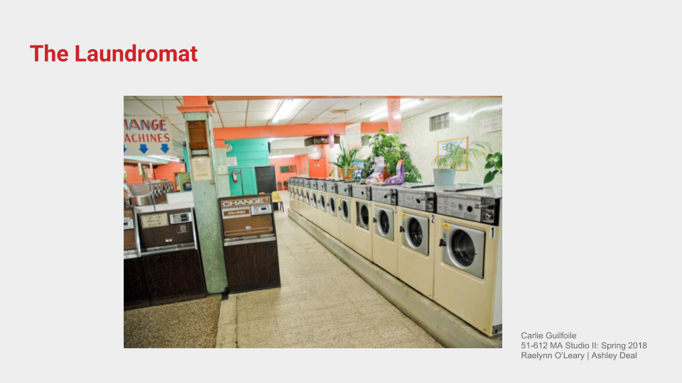
According to public records, more than 15,000 calls are made annually to report violations of child health and safety in Allegheny County, Pennsylvania (Allegheny DHS, 2016). To manage these claims, the county implemented the Allegheny Family Screening Tool (AFST) in 2016, a predictive algorithm helping phone screeners at Child Protection Services (CPS) respond to referrals and identify families in most need of further investigation. The algorithm maps dozens of data points on child related family members and calculates a score between 1 and 20 representing the level of safety and welfare in the home. The tool’s goal is to more accurately predict which children are at the highest risk of danger and should be removed from their homes (Allegheny DHS, 2016).

This first-of-its-kind algorithm has been both praised and criticized for its role in decision-making on behalf of the county. By analyzing the strengths and weaknesses of both human cognition and machine learning, we can begin to see how CPS operators and the AFST can best work together. In this paper, I will asses the reasons why I believe the algorithm should continue being used by the county under three conditions. First, and most critically, the tool should inform human decision-making, but never replace it as a standalone solution; second, the system must support long-term family needs; and third, the decisions and outcomes should be explainable.


Inform, Not Make, Decisions

The Allegheny Family Screening Tool is currently being used by county screeners as a one of many touch points that guide their decision to investigate a family and remove the child from the home. When a screener receives a call, they make their own assessment of the situation and then look up the Family Screening Score calculated by the algorithm. If the score indicates a high risk, they will recommend an in-person home visit before any further action is taken with the child. This structure characterized by active checks-and-balances between the algorithm and the county workers is essential to its long-term success. 

In Mimi Onuoha’s Medium article (2016), “The Point of Collection”, she explains, “Software thrives on abstraction. It flattens out individual variations in favor of types and models.” In the case of the Allegheny Family Screening tool, decisions are being made that impact families, communities, and the greater society. That weight can only be felt by a human, which is why they should be trained and aware of its algorithmic shortcomings, as well as their essential role in decision-making.  

Computer-generated algorithms are excellent at analyzing lots of data points and creating  ‘informed outcomes’, whereas humans are much better at contextualizing and recognizing nuances in data. How might we look at a recovered drug addict differently than an algorithm? Is he or she active in the community or known for their erratic behavior? By working together, the two systems can leverage the other’s strengths to provide thoughtful and holistic recommendations; much like Coons imagined when he described the “collaboration [between humans and technology] as a symbiotic dance (Cardoso Llach, 2015).” Just think, there is no such thing as stepping on an algorithm’s toes. By design, we must work together, both as the lead and follower, to create harmony. 

Some might argue that algorithms are actually designed to be objective, and without fault of human judgement (Hurley, 2018), and in turn, work more accurately on their own. As New York Times author Dan Hurley (2018) writes, “What screeners have is a lot of data…and the human brain is not that deft at harnessing and making sense of all the data.” While it is true that computers can draw connections that humans cannot, it is also the case that only people have the ability to humanize the decision-making process. This is not new. Across industries, recruiters have been utilizing screening tools to lure candidates to new jobs since the early 2000s. Yes, first they use algorithms to identify qualified candidates – but then, they reach out and schedule a set of phone calls before they recommend the individual to the company. Even universities, like Carnegie Mellon, use quantitative GRE scores to qualify candidates for admission, but not without assessing qualitative assets like previous work experience and a statement of purpose. “Perfect on paper” might be good enough for an algorithm, but it doesn’t always cut it in the real world. At Allegheny County CPS, workers can apply their cognitive strengths by asking critical questions at key decision points and visiting families in-person to clarify data-driven judgements.

Support Long-term Family Needs

To date, Allegheny and third party researchers have proven that the AFST is supporting the county’s goal to more accurately predicting children at high risks, but they have also recognized overt biases in the data itself (Courtland, 2018). Although challenging, fairness and accuracy of the algorithm must continue to be monitored by objective human parties. In tandem, in order to fully support the long-term welfare of children and families, they must begin to proactively address system inequalities.

Third-party researchers are currently involved in the development of the AFST and are essential checks-and-balances to the department’s commitment to the wellbeing of all families. In the case of Allegheny County, they have helped identify the fact that families of color have been more impacted by family separation than white families (Courtland, 2018). This has led to discussions about data collection, unearthing the reality that predominantly poor families use public services, which means their data is more widely collected in use of the tool (Courtland, 2018). These imbalances highlight a larger-scale challenge that cannot be solved with a reactionary algorithm or any single-step solution.

Systematic inequalities, such as generational poverty, are wicked problems – a term coined by 20th century planner Horst Rittel (Rittel & Webber, 1973) to describe a type of ill-defined, complex and systemic problem. Allegheny County should use Terry Irwin’s transition design approach to address these challenges. Terry explains (2018) that, “wicked problem resolution requires myriad interventions at multiple levels of scale…[they] always have their roots in the past because it takes years, decades, and even longer for problems to become wicked.”  Some critics might argue that proving transition design’s success is much more difficult than proving success of an algorithm. While I agree that it is difficult to measure quickly, it will actually bring greater social and economic benefits to the county in the long term. It is only proactive approaches like this one that can prevent the conditions that lead to child welfare concerns.

Make it Explainable

The Allegheny County Family Screening Tool is unique in that it has been co-developed by an economist and is operated by the county, not a third party company. In addition, the county has disclosed the variables that are weighed to determine a score. This is important because the algorithms needs to be held accountable (Courtland, 2018) when used to make decisions about people.

Across the globe, lawmakers are passing bills to make information used in software more transparent. Just this year, France’s president made all algorithms used by government open access and Europe passed the General Protection Regulation to promote algorithmic accountability (Courtland, 2018). These legislative updates reflect a clear and immediate need for governments and agencies to both engage deeply in the creation of the algorithm in order to understand it, and to open their doors to public input. 

Although I agree with this approach, the greater challenge is finding knowledgeable developers and designers to create these algorithms. Currently, UX designers have poor mental models of machine learning (Dove, Halskov Forlizzi, Zimmerman, 2017) which makes it very difficult for them to design a transparent system. Some critics might argue that understanding statistical inference is beyond the limits of a designer and point to computer scientists and economists to deeply understand these systems. While I agree that a designers role is not rooted in mathematical inference, I also recognize that machine-generated algorithms are being used more and more to make critical decisions that impact people’s lives. Being that we are human-centered creators, this is an emerging area of technology that should be studied in order to build solutions that can be explained, tested, and fundamentally made accountable to their stakeholders.

Emerging Model

The Allegheny Family Screening Tool is just one of thousands of algorithms that are used by governments and businesses to make decisions about people. Allegheny County’s predictive tool is an emerging model for accountable algorithms, because the county has leveraged its affordances and sought out human action in place for its shortcoming. 

This is reflected in the county’s decision to use human decision-making in the process, rather than use the algorithm as an automated solution. In addition, the county is working with public data and measurable goals, while also inviting critical researchers to test biases. These conditions do not make the algorithm anywhere near perfect, but they do offer an example of how we can better analyze and measure computer-aided decision in our data-driven society. 


Sources:

Allegheny County Department of Human Services. Allegheny Family Screening Tool frequently asked questions. (2017, July 20). Retrieved October 25, 2018, from https://www.alleghenycountyanalytics.us/index.

Courtland, R. (2018, June 20). Bias detectives: The researchers striving to make algorithms fair. Retrieved from https://www.nature.com/articles/d41586-018-05469-3

Daniel Cardoso Llach. 2015. Builders of the Vision: Software and the Imagination of Design. London, New York: Routledge 2015.

Graham Dove, Kim Halskov, Jodi Forlizzi, John Zimmerman, “UX Design Innovation: Challenges for Working with Machine Learning as a Design Material,” CHI ’17 Proceedings of the 2017 CHI Conference on Human Factors in Computing Systems, p. 278–288.

Hurley, D. (2018, January 02). Can an Algorithm Tell When Kids Are in Danger? Retrieved from https://www.nytimes.com/2018/01/02/magazine/can-an-algorithm-tell-when-kids-are-in-danger.html

Onuoha, M. (2016, February 10). The Point of Collection – Data & Society: Points. Retrieved from https://points.datasociety.net/the-point-of-collection-8ee44ad7c2fa

Accessed on Medium

Horst Rittel & Melvin M. Webber, “Dilemmas in a General Theory of Planning,” Policy Science 4 (1973), 155–69. 

Terry Irwin, “The Emerging Transition Design Approach,” DRS2018

Co-Designing Data Visualizations around Mental Health

A project by: Carlie Guilfoile, Jen Brown, Michal Luria, Uluwehi Mills, Supawat Vitoorakaporn.

Although experiencing mental health challenges is universal, the ways individuals communicate such challenges are unique; while some are very open about their personal struggles, others are reticent — this could be part of one’s individual personality, but perhaps also for a host of other reasons, including gender, sociocultural and environmental norms. In a competitive university setting such as Carnegie Mellon, this is no less true, and under intense academic pressure, students may often lack the opportunity to address their mental health challenges in a positive way.

The bottom line, though, is that experts agree that communicating about one’s own mental health in some form or another is hugely beneficial. We decided to focus our efforts on developing methods for tackling communication hurdles. In our first intervention, which we named Personalized Potions, participants engage in a stylized, facilitated activity that takes the burden of communication off by being highly structured yet light-hearted. In the other, called the Empathy Rock Garden, communication was anonymous and solitary, allowing participants to be as expressive as they desired without fear of stigma. Both interventions have a low barrier for participation, being targeted at passersby who can spend less than five minutes interacting but still (hopefully) reap the benefits of self-expression.

Our two interventions have similar intents, but very different executions, to give us the chance to observe the benefits and challenges associated with each with regards to facilitation and gleaning meaningful data.

Personalized Potions

Background

We hoped the participants would think about what they need in their lives in an indirect way. By putting the twist and comfortable or presentation of emotions, as ingredients in a potion, people maybe more open to talking about them. We asked participants to identify something they needed help with in their life. They would then create a “potion” to help them tackle it. We provided the ingredients for the potion, which were all emotions like “hope”, “trust”, and “dedication”.

The project is freeform and individualized in subject; participants can use the activity to address whatever aspect of their own mental health that they choose, however big or small. The goal is to give them an opportunity to express self-compassion, and to pause and reflect on what they need for their own well-being.


Early Prototypes and Testing

We tested the potions concept initially in the classroom. We had small vials and a wide range of materials, pebbles, beads, and moss. We found that too wide of a range of materials was difficult to use, and hindered the users experience. The differing physical qualities of the materials became unimportant, as the names of the ingredients became more defined.

We settled on colored sugar but had some difficulties with it clumping and participants had difficulty getting it into the vial. It took up a lot of time, and people became frustrated. The materials played a part in the participants emotions as well. To ensure ease of use the sugar was dried and sifted for the set up.

1rock.jpg
 
 
10rock.jpg


Two breakthroughs came when we spoke with some counselors in CAPS, who suggested adding a “Secret Ingredient”. This would allow the participants to create their own need if we don’t have it as one of our chosen items. We also wanted participants to think of an “activator” for their potion. We wanted them to take one step or one action towards reaching their goal, and therefore “activating” the potion. They also suggested a “magic 8 ball” approach for the activators. Instead of the testers suggesting things to people, we could allow them to select an activator out of the bag. It would be something broad that could be applicable to most goals.

We conducted a trial run in an office setting to great success. Participants interacted with the ingredients in various ways: some spent careful time choosing them, while others immediately knew exactly what they wanted. Some worked through their reasoning aloud while others pondered internally. All were glad to be able to take their potion home, with one participant saying, “This is a nice motivational thing to keep around here.”

Participants of the Personalized Potions creating their own potions.

Participants of the Personalized Potions creating their own potions.

Components

Components of this activity includes:

  1. Empty vials

  2. Colored Sugar in jars to serve as an abstraction of how much values of each (honesty, hope, compassion, trust, discipline, courage) they need to achieve a certain goal. Although the potion is not designed to be ingested, using an edible ingredient felt like a safe choice.

  3. Spoons and funnel to serve as a slow and deliberate reflection of putting one’s values into a potion.

  4. Wildcard Bag to assist participants who are stumped by how to activate the potion.

  5. Labels & String to act act as easy method to capture data as the vials are given away.

The Final Exhibit

3rock.jpg
2rock.png
  1. The exibit was set up in Resnik dorm near the elevator, on a Monday evening between 7–9pm. Two facilitators talked with participants and asked them to participate. The setting allowed the participants to be conversant with the facilitators, and with other individuals who came by. It provided an environment for conversation, and to engage with other passers-by.

  2. Participants receive a clear glass vial. They are prompted to think about what a potion could help them accomplish in the near future. The participants write down their concern on the potion’s label.

  3. They the fill the vial with “ingredients” (in the form of colored sugar) that will help them towards their stated goal. The ingredients boast names like “Compassion”, “Trust”, “Discipline”, among others, with one wild card ingredient they can name as they see fit. As they fill their vials, the facilitator writes the contents on the label.

  4. Once the vial is filled, the final step is an “activation”: like any good potion, it doesn’t work without a phrase or an action. Participants are free to write whatever they believe to be an actionable first step, or they can draw an inspirational phrase from a bag: “Don’t try so hard.” “Breathe.” “Get some rest.”

  5. The facilitator finishes the label and gives the potion to the participant as a keepsake for continued reflection.

Findings

  1. Discipline (Purple) is the most depleted values from our 2 hour session.

  2. There were certain ingredients that were used more often than others. On the whole CMU student feels like like they need more discipline in their life. It was one of the first ingredients people added. The second most commonly used one was hope followed by the Secret Ingredient. The secret ingredient could be anything the participants wanted, but there were not many repeat needs, almost every one was unique.

  3. Often time the activator wild card of “rest more” is discarded.

  4. Playfully abstracting heavy questions such as “what are your values”, “what do you want to achieve”, and “how do you plan on achieving it” via an activity helps ease the conversation and help participants open up. Participants were very open to talking about their emotions, and why they were feeling stressed, upset, lonely or afraid. This interface allowed total strangers to share emotions, and talk through what they need in their lives. The outcome was incredibly positive and opened a communication door between the testers and participants. The process of identifying a need, and working through it, is something that most people don’t often do. They don’t often have the tools to identify, analyze, and act on an emotional problem, let along in a short period of time. The potions facilitated that process, and allowed people to lightly approach something difficult, and to have a tool to talk about.

Empathy Rock Garden

Background

Our final concept and physicalization of mental health, the Empathy Rock Garden, is a space where participants can express what is weighing on their mind, by writing on a rock, or they can signal to others that they are not alone, by placing a pebble near another rock. The experience is anonymous, quiet, and collaborative.

Empathy Rock Garden was inspired by two core concepts and experiences. Cairns, or human-made piles of stones, were an early influence that reflect our concept’s roots in nature and stewardship. When brainstorming, we spoke about both the therapeutic qualities of balancing rocks and their oft-purpose in helping to signal to others a direction or path, perhaps on a hiking trail. Secondly, we were inspired by a teammate’s experience expressing her anxiety by placing heavy objects in spaces inside her home that represented her mental state. An example might be, placing a heavy rock under the bed when she’s feeling recluse and anxious.

Early Prototypes and Testing

unnamed.jpg

In our early prototypes of the concept, we used tape to section off a table into different categories, such as school and family, that people might feel stressed about. We also mocked up a scale on the radius of the table, that might help people measure and place the intensity of their feelings. After in-class testing, we came to the conclusion that this was too prescriptive and we should give participants more flexibility and freedom. Secondly, we experimented with the materiality of the components. Within that exploration, we discussed whether people would write directly on a rock or on a note, which would then be rubber banded to the rock. We asked questions like: Should the rocks be natural or painted ? Dark or light? Stacked or spaced? Placed outside or inside? Through rapid prototyping and testing with the class, we learned that people wanted to be able to easily read the messages on the rocks and they also wanted it to feel private and calm. Based on that feedback, we moved forward with unaltered natural materials and black sharpies.

Components

Due to the nature of the Empathy Rock Garden, it was important that we developed components that could stand alone and communicate without human facilitation. The components of the experience include: smooth medium-size stones, small pebbles, muslin baskets and tablecloth, black sharpies and bamboo signs.

The Final Exhibit

Our final exhibit was located on the 4th floor of the CMU Hunt library, where we hoped people would be able to quietly interact with it. The exhibit included a large 6’ table with a few rocks that we placed as encouragement for people to participate, as well as to provide some indication of what they are asked to do. New rocks to write on were placed on a table nearby, along with signs that had some explanatory text.

unnamed (2).jpg
unnamed (1).jpg
6rock.jpg

We hoped that people would interact with the exhibit in a circular interaction — first, encounter the sign that introduces the exhibit as an ‘empathy rock garden’, then walk halfway around the table to reach the additional rocks, while reflecting on what other people wrote, and finally come the other side of the table and place their own rock, or rocks, on the table.

Findings

Interaction: Due to the nature of the exhibit, we were unable to observe when people interacted with it. Thus, our findings stem from observing the rock people left behind, and from few observations that we observed when one of the researchers was around.

We noticed that many more participants placed small rocks on the table that symbolize empathy, rather than adding new ascribed rocks. This was even more common once there were many rocks on the table. Furthermore, we noticed that people interacted longer than just placing a single rock of empathy — some took a handful of rocks, and distributed them among the displayed rocks.

Content: we found a range of topics, from concrete things that are weighing people down (for example, a class), to more abstract thoughts. From happy, optimistic messages, to very difficult ones. It is not surprising, given our prompt, that most of the messages were related to negative affection.

7rock.jpg
9rock.jpg
8rock.jpg

We notices that messages with negative emotion tended to receive more ‘small rock attention’. This could be either because it was easier for people to relate to difficult emotions, or because they felt that people who wrote difficult things on the rocks need more empathy and support for fellow passersby.

Form: Most people used the rocks in a straightforward way — big rocks were placed where there was space, and small rocks anywhere near a big rock. We expected there to be more interaction between rocks, but there were very few that commented on another, or were placed next to another to indicate a relationship.

For the small rocks, people used them with more creativity. For example, people placed small rocks on top of a big one, or stacked them on top of each other. Some people created shapes using the small rocks, for example a shape of a cross next to the text “please save me”.

Inevitably we had some people diverge from the intended interaction. Some of it worked well, for example a humorous message about rocks, which many other people engaged with by placing small rocks. Some was not as great — one participant created a phallus shape that had to be fixed by one of the researchers. We learned this is something that needs to be considered when placing an exhibit in a quiet environment where people have privacy interacting — some people express themselves in a more playful way, that may not always suit the designers’ intention. This requires to occasionally intervene and decide whether it enhances the interaction or reduces from it.

Comparing Methods and Outcomes

Each intervention allowed for distinct takeaways for their participants. Personalized Potions was an opportunity for very individual reflection, and the artifact that participants received is a call-to-action to take charge of their mental health beyond their participation in the intervention. On the other hand, the artifacts of the Empathy Rock Garden were meant to be left behind, to act as a way for subsequent participants to reflect collectively over time. While the rock garden was perhaps a better method for the CMU population to consider their mental health as a community, the potions allowed for collective reflection as well — by observing how much of each ingredient was used, we could understand what the community overall considers to be necessary for their well-being.

We also learned that even with established rules for both interactions, participants found ways to express themselves outside of them. In many cases, this allowed for particularly poignant results that would not otherwise have been possible. In others, particularly with the unfacilitated interaction, the unexpected interactions did not contribute to the experience, and at worst compromised potential data points. We understand now that more structure to the projects allowed for more usable data to be collected, but allowing space for flexibility means that participants can contribute in ways we hadn’t previously considered.

Closing Reflections

In both cases, staging the interventions in the right environment seemed to matter greatly — the casual, light-hearted nature of the potion project, and the solitary reflection of the rock garden may not have been possible if staged in a different place or time. Having enthusiastic facilitators for the potions also helped keep communication flowing.

unnamed (4).jpg

There are plans for Personalized Potions to be staged again in Resnik later in the fall; it will be interesting to see what participants decide to tackle with their potions in a different setting, and at a different time in the academic year. Although there are no current plans to revive the Empathy Rock Garden, we enjoyed watching the exhibition develop over time and would gladly stage it again. With slightly more facilitation, we might be able to improve our ability to gather measurable data — by limiting the number of rocks a participant can use, for example. Regardless, though, both of these projects had the kind of impact that we were hoping to have on participants — they were able to communicate in meaningful ways, and we hope that these conversations continue beyond the life of the exhibits.

A look at microinteractions

For my first studio project, I was tasked with designing a control for a laundromat that has a distinct input and associated outcome. After observing users at LaundryTime in my neighborhood and asking students about their experiences doing laundry outside of their home, I became interested in how customers selected detergent from the onsite vending machine.

Research

To develop my solution, I observed users at a local laundromat and conducted user interviews. I also made an inventory of interactions that take place at the laundromat. In this inventory of interactions, I focused on: user goals, conceptual models, affordances, constraints, mapping, signifiers, and feedback. 

Ideation

After deciding on a control for the detergent machine, I took to doing more sketches of possible designs before prototyping the physical form. I came up with a handful of ideas that were guided by the following design principles:

  1. Discoverability: Using affordances to discover what actions are possible

  2. Use the overlooked: Convey the most with the least.

  3. Delight: Give the user pleasure while discovering your control.

Laundry2.png
Launrdy1.png

Solution

My final solution encompasses a new control that enables users to smell the laundry detergent options before they select one for purchase. This control was laser cut and designed to be integrated into the existing vending machine and accessed through a simple push & drag motion of the finger.

A Focus on Detail

I used acrylic because it gives a very clean feel, exactly what these users are looking for at the laundromat. When thinking about the act of smelling, I brainstormed ways I could add subtle details to my design that would delight the user and also use the overlooked. I decided that the holes should make a pattern that reflected the smell of detergent inside. I thought this would not only bring some pleasure to the user but also help them make connections between smells and detergent types. I used the laser cutter in the 3D Lab to cut my materials before beginning the construction process.  

Microinteractions are the functional, interactive details of a product, and details, as Charles Eames famously said, aren’t just the details; they are the design.
— Dan Saffer

Creating a conversational user interface via DialogFlow

The first assignment in my IxD prototyping class was to build a conversational user interface using Dialogflow. We started by developing digital task flows and getting familiar with the software. Next, we built out the entities and intents for one specific task flow. I really liked playing with the "small talk" feature, which makes that bot feel more human. It was also interesting to see machine learning at work. The more I interacted with my bot, the more it understood what I wanted...even if I made a verbal mistake. 

Conversational interactions have emerged to allow us to keep our hands free so we can do more than one thing at once. We can initiate a call while we’re driving without touching our phone, order items for a party next week while we’re cooking dinner, or add an event to our calendar while we’re getting ready in the morning.


Ordering Pizza from Pizza Hut.png

Hungry? Order with the Pizza Maker bot.


Analyzing music as a service

In Molly's Service Design class, I've been working with Zahin and Lily on a music service research project. We were assigned SOUNDMACHINE, a cloud based music service for businesses, and were given a week to research and present our findings. Together, we dug into the company's business model, stakeholders and licensing agreements with artists. We also developed value flows and a service blueprint to illustrate the oft-unseen complexity of music licensing.

What is interesting about SOUNDMACHINE is that they are helping bridge that value gap between artists' compensation and music usage by businesses. The company faces a lot of competition, especially with companies like Spotify Business who have a much larger loyalty base and more sophisticated design + ux. That said, they have an opportunity to generate broad awareness of music licensing policies to small to medium-size businesses and offer a lower price point than competitors. 

Next project, we will be designing our own unique music services. As subscription models and custom playlists (like Spotify offers) takeover the music market, it will be interesting to analyze just how the music experience has changed since the height of CDs and even, iTunes. How might we design a music service that captures a unique audience and is also structured to benefit the artists?  

Thinking Young: A Design Thinking Manual

Hi friends, I want to share the design thinking manual I created last semester called: Thinking Young. This was a project I toiled with for weeks, wondering if (in the time that I had) it would come together in the way I imagined. In the end, I was really proud of the final product. By writing this manual, I learned and internalized new methods to get "unstuck" and spur creativity. I also integrated theory from the greats who've come before me, including: Buchanan, Dorst, Brown, Lawson & Cross and Thackara. I was inspired by kids, who are some of the most creative beings among us. At their best, they are endless questioners who are unafraid and unabashed when trying something new. As design thinkers, those are all characteristics we should strive to adopt when problem solving. 

You can download the full PDF of Thinking Young here.  

Different people think about creativity in different ways. The same holds true for design thinking. Over the last few decades, dozens of designers, managers, entrepreneurs, scientists, architects and engineers have weighed in with their definition of design thinking. Some believe it is a designated process for problem solving while others think it’s a physical process of making things. It’s said to be a tool-kit, a never ending loop and a step-by-step intervention. Through my education on this subject, I have learned there is no sweeping definition or cure-all for creativity. Everyone has their own approach and each one of them hold value. 

I believe design thinking is a practice that helps you break assumptions, reframe your approach and create new meaning in the process. Only by stepping away from what you know to be true, can you begin to explore new possibilities and unmarked boundaries. There is no one that does this better than the un-knowing hooligans themselves: kids. 

This visually-infused guide explores ways for readers to see the world differently by thinking young. Through stories, creative insights, interactive activities and a bit of design theory, readers can discover the inner workings of the creative practice. The eight articles within this guide are organized by category, but can be read in whatever order you prefer. Upon completion of the manual, readers will better understand design thinking and how to apply it in everyday life.

This guide is not a call to forget who you are today or trade in your maturity. The real magic happens when you can combine your current experience with a fresh, curious way of thinking about the world. 

Enjoy and embrace thinking young. 
— Thinking Young Author's Note

10 reasons why design is like yoga

Last semester, in Bruce Hanington's Design Principles & Practices class, we were asked to reflect on our own experiences over the first semester and present a summary of what it means to engage in design. At the time, I was working on at least three different final projects and often stopped to tell myself "Breathe, Carlie. You got this." When it came time to develop my summary, I started thinking about all of the challenging and clarifying moments I experienced throughout the semester. I thought about the balance needed to be a good designer – and the importance of doing, thinking and reflecting on repeat. I also thought about the always-evolving state of design and the people doing it. As I was writing down these thoughts, I realized that the practice of design was not that different from my practice of yoga. Among many things, I always had to remember to breathe.

Here are 10 reasons why design is like yoga.